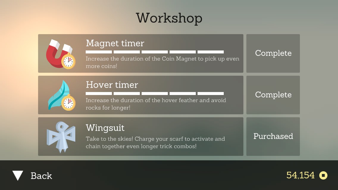
There is no IAP, but there is an in-game currency easily obtained during play. I was able to get all the items in a few hours.
There’s a lot to love about Alto’s Adventure. It’s a fun endless runner for iOS with amazing artwork, and the ability to unlock a llama. What more could you want? There are already a vast number of reviews for the game, so I’m not going to review the game play. I want to talk about why Alto’s Adventure is so good from a UX perspective.
The folks at Snowman nailed a number of details throughout the app that make for an experience far better than your average iOS game. The first is their pricing model. Instead of going ‘freemium’– where you download the app for free, but are endlessly badgered into countless micro-payments in order to extend play — they went with a pay-for-download, aka ‘premium’ model. While this could hinder total number of sales, I reckon the audience they wished to serve is perfectly fine with paying the $2 entry fee. There is no IAP (In-App Purchase) in the game, although there is in-game currency, which is easily accumulated during play. That choice alone creates a cello-like legato vibe for the game. It says “we want you to kick back and enjoy the ride”. It’s so refreshing to not be harassed at every opportunity.
There is no IAP, but there is an in-game currency easily obtained during play. I was able to get all the items in a few hours.
User Experience practitioners often talk about “affordances”. These are the little hints an object gives the user based on its physical characteristics and context. For example, a handle can be pulled, whereas a button is pressed. The physical properties and context allow you to create a mental model of how that object works, before manipulating it. Affordances alert users to context changes, and the potential for interaction.
Alto’s Adventure does a delightful job informing you what to do, without paragraphs of text, or a series of overlays and coach marks. It starts on the title screen, where there are three areas of interaction. The top two are secondary areas which have both iconography and text labels. While they are not traditionally shaped like a button, the icon in combination with their label allows you to guess as to what would happen if they tapped on either area. The primary call to action is an imperative: “tap to start”. This can be done from anywhere on the screen, not just the text label. Having a nearly infinite tap target reduces user error in achieving the primary goal of starting the game. The screen isn’t perfect, as their “change player” icon is difficult to see, as it’s in a busy portion of the screen, and is lacking in a text label. I’ve mis-tapped that icon more than once.
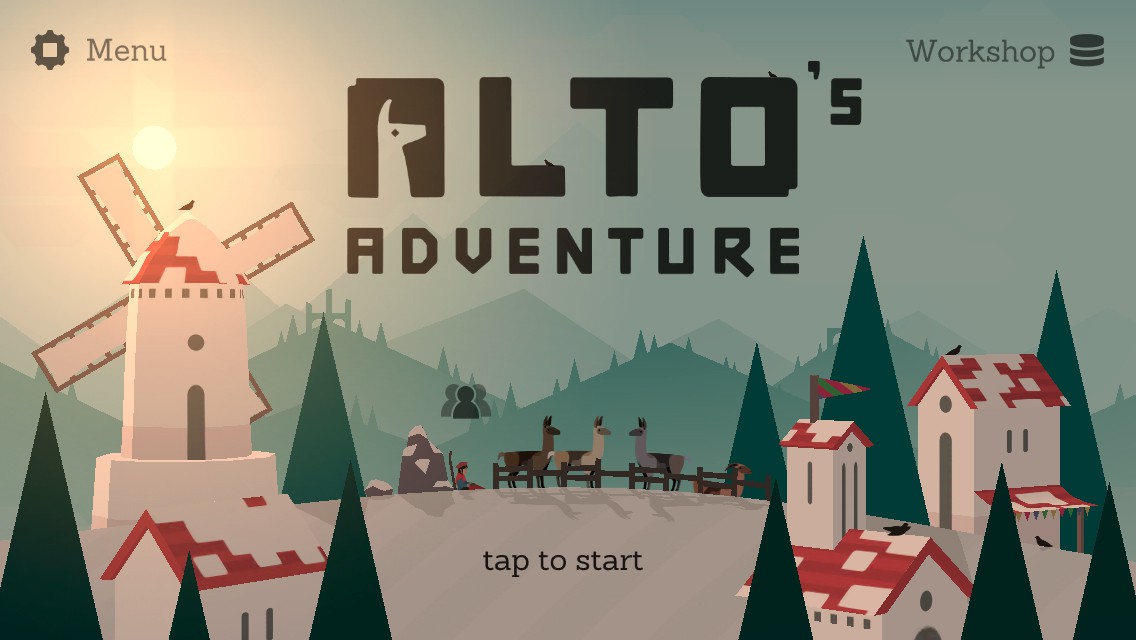
Icons with labels, and a nearly-infinite tap area for the main call to action are welcome affordances. Not so great is the “change character” button.
During play, there are a few welcome affordances. One set is when you encounter the dreaded chasms. The first warning is a signpost stuck in the ground. It’s in the shape of a triangle, which is the international symbol signaling a warning. However, often you are high enough in the air that you can’t see the sign. It’s here where the game does something rather clever. The camera pulls back and downward a moment before you get to the chasm. This allows players an instant to prepare for the jump.
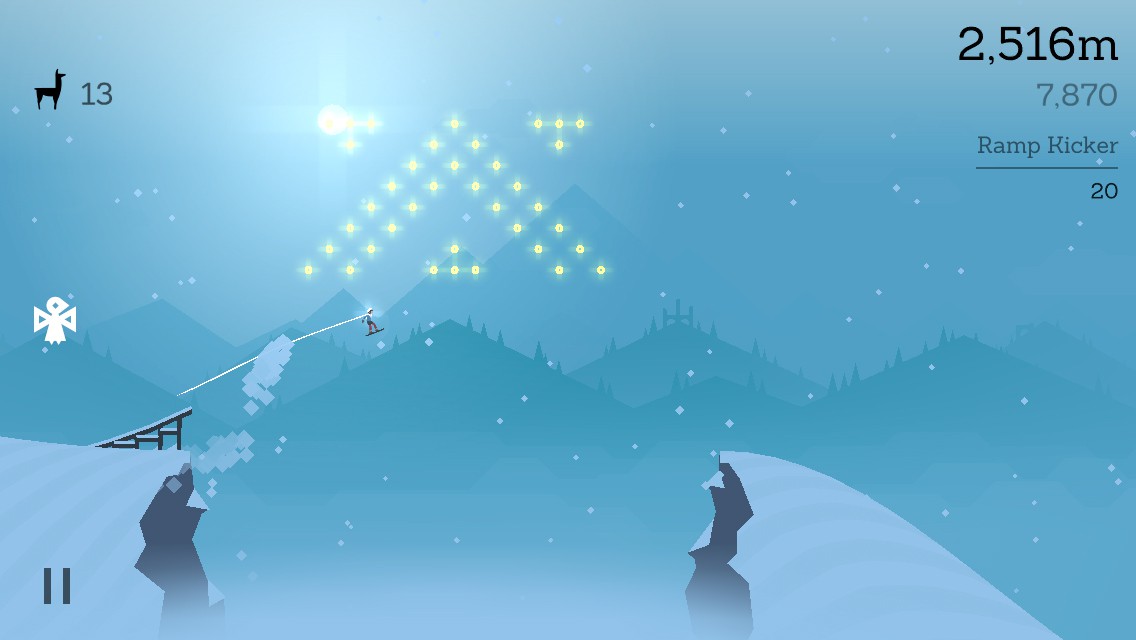
Just before the chasm, the camera zooms out and down warning the player of the dangerous chasm. The camera changes back to the default position once you have cleared the chasm.
As you play, the environment changes from day to night, and from clear to stormy. This can make it difficult to see dangerous rocks in your path. Very often, a trail of coins will be set in an arc over an obstacle, giving you plenty of time to jump.
One of the things that makes this game such a joy is that unlike many games, it’s forgiving of your imprecision. You don’t need to be as precise in your actions. You don’t have to nail a perfect landing, unlike the similar game Tiny Wings. In fact, your character will naturally level herself if you bail on a backflip midway through. This makes the game much more like a beautiful leisurely cruise down the mountain than a hard-core racing physics simulator. That isn’t to say the game isn’t challenging — it is quite difficult in places — but the makers want you to enjoy your journey just as much as they want you to accomplish the level’s objectives.
Even those pesky rocks and bonfires have some leniency. Many a time I should have eaten snow by jumping a wee too late. Instead, I find my board kicked up just high enough that instead of crashing, I bounce off the obstacle, and continue my journey. If I’m really lucky, I can chain another backflip before I land.
The items I’ve covered in this post aren’t exhaustive, but it should make you think how affordances can make your app better. Often when we build something, we think it through, collaborate with others, and iterate dozens of times before the final product. Decisions are made based on what seems to be a logical path. Unfortunately your users haven’t been in all of those meetings, and their mental model of your app isn’t yours. They can’t make the logical leaps you did, as they don’t have context. You must supply that context, and allow them to apply what they do know to your app.
Be forgiving. Your users come from a variety of different backgrounds, and perceive things differently. Most users are scared to try things for fear of messing something up, breaking something, or not being able to return to where they were. When something goes wrong, they blame themselves. When something goes wrong, remember, they haven’t made a mistake — your app simply didn’t meet their desire. Allow your users to recover easily from their unintended actions. If you must throw an error dialog, don’t ever blame them for their actions.